mirror of
https://github.com/vale981/emacs-ipython-notebook
synced 2025-03-06 17:41:40 -05:00
357 lines
10 KiB
Markdown
357 lines
10 KiB
Markdown
|
popup.el
|
||
|
|
========
|
||
|
|
|
||
|
|
[](http://travis-ci.org/auto-complete/popup-el) [![melpa badge][melpa-badge]][melpa-link] [![melpa stable badge][melpa-stable-badge]][melpa-stable-link]
|
||
|
|
|
||
|
|
Overview
|
||
|
|
--------
|
||
|
|
|
||
|
|
popup.el is a visual popup user interface library for Emacs. This
|
||
|
|
provides a basic API and common UI widgets such as popup tooltips and
|
||
|
|
popup menus.
|
||
|
|
|
||
|
|
Screenshots
|
||
|
|
-----------
|
||
|
|
|
||
|
|
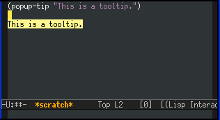
**Tooltip**
|
||
|
|
|
||
|
|
|
||
|
|
|
||
|
|
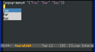
**Popup Menu**
|
||
|
|
|
||
|
|
|
||
|
|
|
||
|
|
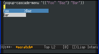
**Popup Cascade Menu**
|
||
|
|
|
||
|
|
|
||
|
|
|
||
|
|
Installation
|
||
|
|
------------
|
||
|
|
|
||
|
|
You can install `popup.el` from [MELPA](https://melpa.org/) with package.el.
|
||
|
|
popwin is tested under GNU Emacs 24 or later.
|
||
|
|
|
||
|
|
Alternatively, users of Debian 9 or later or Ubuntu 16.04 or later may
|
||
|
|
simply `apt-get install elpa-popup`.
|
||
|
|
|
||
|
|
Popup Items
|
||
|
|
-----------
|
||
|
|
|
||
|
|
Elements of `popup-list` have to be popup items. A popup item is
|
||
|
|
substantially a string but it may involve some text-properties. There
|
||
|
|
are two ways to make popup items. One is just using strings. Another
|
||
|
|
is to use the `popup-make-item` function, which just returns the string
|
||
|
|
after adding text-properties of its keywords. Effective text-properties
|
||
|
|
are:
|
||
|
|
|
||
|
|
* `value` -- This represents the **real** value of the item. This will
|
||
|
|
be used when returning the value but not the item (or string) from
|
||
|
|
some synchronous functions such as `popup-menu*`.
|
||
|
|
* `face` -- The background face of the item. The value of `popup-face`
|
||
|
|
will be overridden.
|
||
|
|
* `selection-face` -- The selection face of the item. The value of
|
||
|
|
`popup-selection-face` will be overridden.
|
||
|
|
* `document` -- The documentation string or function of the item.
|
||
|
|
* `summary` -- The summary string of the item. This will be shown
|
||
|
|
inline with the item.
|
||
|
|
* `symbol` -- The symbol character of the item.
|
||
|
|
* `sublist` -- The sublist of the item. This is effective only with
|
||
|
|
`popup-cascade-menu`.
|
||
|
|
|
||
|
|
All of properties can be accessed by `popup-item-<property>` utility function.
|
||
|
|
|
||
|
|
### Function: `popup-item-propertize`
|
||
|
|
|
||
|
|
popup-item-propertize item &rest properties => item
|
||
|
|
|
||
|
|
Same as `propertize` except that this avoids overriding existed value
|
||
|
|
with `nil` property.
|
||
|
|
|
||
|
|
### Function: `popup-make-item`
|
||
|
|
|
||
|
|
popup-make-item name &key value popup-face selection-face sublist
|
||
|
|
document symbol summary => item
|
||
|
|
|
||
|
|
The utility function of `popup-item-propertize`.
|
||
|
|
|
||
|
|
Popups
|
||
|
|
------
|
||
|
|
|
||
|
|
This section describes the basic data structures and operations of
|
||
|
|
popups.
|
||
|
|
|
||
|
|
### Struct: `popup`
|
||
|
|
|
||
|
|
Any instance of `popup` structure has the following fields (some
|
||
|
|
unimportant fields are not listed):
|
||
|
|
|
||
|
|
* `point`
|
||
|
|
* `row` -- The line number.
|
||
|
|
* `column`
|
||
|
|
* `width` -- Max width of `popup` instance.
|
||
|
|
* `height` -- Max height of `popup` instance.
|
||
|
|
* `min-height`
|
||
|
|
* `current-height`
|
||
|
|
* `direction` -- Positive number means forward, negative number means
|
||
|
|
backward.
|
||
|
|
* `parent` -- The parent of `popup` instance.
|
||
|
|
* `face` -- The background face.
|
||
|
|
* `selection-face`
|
||
|
|
* `margin-left`
|
||
|
|
* `margin-right`
|
||
|
|
* `scroll-bar` -- Non-nil means `popup` instance has a scroll bar.
|
||
|
|
* `symbol` -- Non-nil means `popup` instance has a space for
|
||
|
|
displaying symbols of item.
|
||
|
|
* `cursor` -- The current position of `list`.
|
||
|
|
* `scroll-top` -- The offset of scrolling.
|
||
|
|
* `list` -- The contents of `popup` instance in a list of items
|
||
|
|
(strings).
|
||
|
|
* `original-list` -- Same as `list` except that this is not filtered.
|
||
|
|
|
||
|
|
All of these fields can be accessed by `popup-<field>` function.
|
||
|
|
|
||
|
|
### Function: `popup-create`
|
||
|
|
|
||
|
|
popup-create point width height &key min-height max-width around face
|
||
|
|
selection-face scroll-bar margin-left margin-right symbol parent
|
||
|
|
parent-offset => popup
|
||
|
|
|
||
|
|
Create a popup instance at `POINT` with `WIDTH` and `HEIGHT`.
|
||
|
|
|
||
|
|
`MIN-HEIGHT` is the minimal height of the popup. The default value is 0.
|
||
|
|
|
||
|
|
`MAX-WIDTH` is the maximum width of the popup. The default value is
|
||
|
|
nil (no limit). If a floating point, the value refers to the ratio of
|
||
|
|
the window. If an integer, limit is in characters.
|
||
|
|
|
||
|
|
If `AROUND` is non-nil, the popup will be displayed around the point
|
||
|
|
but not at the point.
|
||
|
|
|
||
|
|
`FACE` is the background face of the popup. The default value is
|
||
|
|
`popup-face`.
|
||
|
|
|
||
|
|
`SELECTION-FACE` is the foreground (selection) face of the popup The
|
||
|
|
default value is `popup-face`.
|
||
|
|
|
||
|
|
If `SCROLL-BAR` is non-nil, the popup will have a scroll bar at the
|
||
|
|
right.
|
||
|
|
|
||
|
|
If `MARGIN-LEFT` is non-nil, the popup will have a margin at the left.
|
||
|
|
|
||
|
|
If `MARGIN-RIGHT` is non-nil, the popup will have a margin at the
|
||
|
|
right.
|
||
|
|
|
||
|
|
`SYMBOL` is a single character which indicates the kind of the item.
|
||
|
|
|
||
|
|
`PARENT` is the parent popup instance. If `PARENT` is omitted, the popup
|
||
|
|
will be a root instance.
|
||
|
|
|
||
|
|
`PARENT-OFFSET` is a row offset from the parent popup.
|
||
|
|
|
||
|
|
Here is an example:
|
||
|
|
|
||
|
|
(setq popup (popup-create (point) 10 10))
|
||
|
|
(popup-set-list popup '("Foo" "Bar" "Baz"))
|
||
|
|
(popup-draw popup)
|
||
|
|
;; do something here
|
||
|
|
(popup-delete popup)
|
||
|
|
|
||
|
|
### Function: `popup-delete`
|
||
|
|
|
||
|
|
popup-delete popup
|
||
|
|
|
||
|
|
Delete the `POPUP`.
|
||
|
|
|
||
|
|
### Function: `popup-live-p`
|
||
|
|
|
||
|
|
popup-live-p popup => boolean
|
||
|
|
|
||
|
|
### Function: `popup-set-list`
|
||
|
|
|
||
|
|
popup-set-list popup list
|
||
|
|
|
||
|
|
Set the contents of the `POPUP`. `LIST` has to be popup items.
|
||
|
|
|
||
|
|
### Function: `popup-draw`
|
||
|
|
|
||
|
|
popup-draw popup
|
||
|
|
|
||
|
|
Draw the contents of the `POPUP`.
|
||
|
|
|
||
|
|
### Function: `popup-hide`
|
||
|
|
|
||
|
|
popup-hide popup
|
||
|
|
|
||
|
|
Hide the `POPUP`. To show again, call `popup-draw`.
|
||
|
|
|
||
|
|
### Function: `popup-hidden-p`
|
||
|
|
|
||
|
|
popup-hidden-p popup
|
||
|
|
|
||
|
|
Return non-nil if the `POPUP` is hidden.
|
||
|
|
|
||
|
|
### Function: `popup-select`
|
||
|
|
|
||
|
|
popup-select popup index
|
||
|
|
|
||
|
|
Select the item of `INDEX` of the `POPUP`.
|
||
|
|
|
||
|
|
### Function: `popup-selected-item`
|
||
|
|
|
||
|
|
popup-selected-item popup => item
|
||
|
|
|
||
|
|
Return the selected item of the `POPUP`.
|
||
|
|
|
||
|
|
Return non-nil if the `POPUP` is still alive.
|
||
|
|
|
||
|
|
### Function: `popup-next`
|
||
|
|
|
||
|
|
popup-next popup
|
||
|
|
|
||
|
|
Select the next item of the `POPUP`.
|
||
|
|
|
||
|
|
### Function: `popup-previous`
|
||
|
|
|
||
|
|
popup-previous popup
|
||
|
|
|
||
|
|
Select the next item of the `POPUP`.
|
||
|
|
|
||
|
|
### Function: `popup-scroll-down`
|
||
|
|
|
||
|
|
popup-scroll-down popup n
|
||
|
|
|
||
|
|
Scroll down `N` items of the `POPUP`. This won't wrap.
|
||
|
|
|
||
|
|
### Function: `popup-scroll-up`
|
||
|
|
|
||
|
|
popup-scroll-up popup n
|
||
|
|
|
||
|
|
Scroll up `N` items of the `POPUP`. This won't wrap.
|
||
|
|
|
||
|
|
### Function: `popup-isearch`
|
||
|
|
|
||
|
|
popup-isearch popup &key cursor-color keymap callback help-delay
|
||
|
|
=> boolean
|
||
|
|
|
||
|
|
Enter incremental search event loop of `POPUP`.
|
||
|
|
|
||
|
|
Tooltips
|
||
|
|
--------
|
||
|
|
|
||
|
|
A tooltip is an useful visual UI widget for displaying information
|
||
|
|
something about what cursor points to.
|
||
|
|
|
||
|
|
### Function: `popup-tip`
|
||
|
|
|
||
|
|
popup-tip string &key point around width height min-height max-width
|
||
|
|
truncate margin margin-left margin-right scroll-bar parent
|
||
|
|
parent-offset nowait nostrip prompt
|
||
|
|
|
||
|
|
Show a tooltip with message `STRING` at `POINT`. This function is
|
||
|
|
synchronized unless `NOWAIT` specified. Almost all arguments are same as
|
||
|
|
`popup-create` except for `TRUNCATE`, `NOWAIT`, `NOSTRIP` and `PROMPT`.
|
||
|
|
|
||
|
|
If `TRUNCATE` is non-nil, the tooltip can be truncated.
|
||
|
|
|
||
|
|
If `NOWAIT` is non-nil, this function immediately returns the tooltip
|
||
|
|
instance without entering event loop.
|
||
|
|
|
||
|
|
If `NOSTRIP` is non-nil, `STRING` properties are not stripped.
|
||
|
|
|
||
|
|
`PROMPT` is a prompt string used when reading events during the event
|
||
|
|
loop.
|
||
|
|
|
||
|
|
Here is an example:
|
||
|
|
|
||
|
|
(popup-tip "Hello, World!")
|
||
|
|
;; reach here after the tooltip disappeared
|
||
|
|
|
||
|
|
Popup Menus
|
||
|
|
-----------
|
||
|
|
|
||
|
|
Popup menu is an useful visual UI widget for prompting users to
|
||
|
|
select an item of a list.
|
||
|
|
|
||
|
|
### Function: `popup-menu*`
|
||
|
|
|
||
|
|
popup-menu* list &key point around width height margin margin-left
|
||
|
|
margin-right scroll-bar symbol parent parent-offset keymap
|
||
|
|
fallback help-delay nowait prompt isearch isearch-filter isearch-cursor-color
|
||
|
|
isearch-keymap isearch-callback initial-index => selected-value
|
||
|
|
|
||
|
|
Show a popup menu of `LIST` at `POINT`. This function returns the value
|
||
|
|
of the selected item. Almost all arguments are same as `popup-create`
|
||
|
|
except for `KEYMAP`, `FALLBACK`, `HELP-DELAY`, `PROMPT`, `ISEARCH`,
|
||
|
|
`ISEARCH-FILTER`, `ISEARCH-CURSOR-COLOR`, `ISEARCH-KEYMAP`
|
||
|
|
and `ISEARCH-CALLBACK`.
|
||
|
|
|
||
|
|
If `KEYMAP` is provided, it is a keymap which is used when processing
|
||
|
|
events during event loop.
|
||
|
|
|
||
|
|
If `FALLBACK` is provided, it is a function taking two arguments; a key
|
||
|
|
and a command. `FALLBACK` is called when no special operation is found
|
||
|
|
on the key. The default value is `popup-menu-fallback`, which does
|
||
|
|
nothing.
|
||
|
|
|
||
|
|
`HELP-DELAY` is a delay of displaying helps.
|
||
|
|
|
||
|
|
If `NOWAIT` is non-nil, this function immediately returns the menu
|
||
|
|
instance without entering event loop.
|
||
|
|
|
||
|
|
`PROMPT` is a prompt string when reading events during event loop.
|
||
|
|
|
||
|
|
If `ISEARCH` is non-nil, do isearch as soon as displaying the popup
|
||
|
|
menu.
|
||
|
|
|
||
|
|
`ISEARCH-FILTER` is a filtering function taking two arguments:
|
||
|
|
search pattern and list of items. Returns a list of matching items.
|
||
|
|
|
||
|
|
`ISEARCH-CURSOR-COLOR` is a cursor color during isearch. The default
|
||
|
|
value is `popup-isearch-cursor-color'.
|
||
|
|
|
||
|
|
`ISEARCH-KEYMAP` is a keymap which is used when processing events
|
||
|
|
during event loop. The default value is `popup-isearch-keymap`.
|
||
|
|
|
||
|
|
`ISEARCH-CALLBACK` is a function taking one argument. `popup-menu`
|
||
|
|
calls `ISEARCH-CALLBACK`, if specified, after isearch finished or
|
||
|
|
isearch canceled. The arguments is whole filtered list of items.
|
||
|
|
|
||
|
|
If `INITIAL-INDEX` is non-nil, this is an initial index value for
|
||
|
|
`popup-select`. Only positive integer is valid.
|
||
|
|
|
||
|
|
Here is an example:
|
||
|
|
|
||
|
|
(popup-menu* '("Foo" "Bar" "Baz"))
|
||
|
|
;; => "Baz" if you select Baz
|
||
|
|
(popup-menu* (list (popup-make-item "Yes" :value t)
|
||
|
|
(popup-make-item "No" :value nil)))
|
||
|
|
;; => t if you select Yes
|
||
|
|
|
||
|
|
### Function: `popup-cascade-menu`
|
||
|
|
|
||
|
|
Same as `popup-menu` except that an element of `LIST` can be also a
|
||
|
|
sub-menu if the element is a cons cell formed `(ITEM . SUBLIST)` where
|
||
|
|
`ITEM` is an usual item and `SUBLIST` is a list of the sub menu.
|
||
|
|
|
||
|
|
Here is an example:
|
||
|
|
|
||
|
|
(popup-cascade-menu '(("Top1" "Sub1" "Sub2") "Top2"))
|
||
|
|
|
||
|
|
|
||
|
|
### Customize Variables
|
||
|
|
|
||
|
|
#### `popup-isearch-regexp-builder-function`
|
||
|
|
|
||
|
|
Function used to construct a regexp from a pattern. You may for instance
|
||
|
|
provide a function that replaces spaces by '.+' if you like helm or ivy style
|
||
|
|
of completion. Default value is `#'regexp-quote`.
|
||
|
|
|
||
|
|
----
|
||
|
|
|
||
|
|
Copyright (C) 2011-2015 Tomohiro Matsuyama <<m2ym.pub@gmail.com>>
|
||
|
|
|
||
|
|
[melpa-link]: https://melpa.org/#/popup
|
||
|
|
[melpa-stable-link]: https://stable.melpa.org/#/popup
|
||
|
|
[melpa-badge]: https://melpa.org/packages/popup-badge.svg
|
||
|
|
[melpa-stable-badge]: https://stable.melpa.org/packages/popup-badge.svg
|